Typography — Clash Display
Introduced Clash Display as the display typeface for headlines, adding a visual layer that's more in tune with the circuit-board aesthetic and distinct from the body text.
Geist Sans is a great font. Clean, modern, highly readable. Using it for both headlines and body is a perfectly sensible starting point. But as the site developed its own visual language, it felt like there was room for a headline face that pushed the character a bit further.
- -No display/body contrast: When headlines and body text share the same typeface, the visual system has one fewer layer to work with. A distinct display face creates a natural hierarchy that size alone can't fully achieve.
- -Geist carries Vercel's identity: Geist was designed for Vercel and it's closely associated with their aesthetic. That's not a problem in itself, but as Unkey builds its own brand, a headline face specifically chosen for this product adds something.
- -Headlines can do more: Geist works beautifully at body sizes. At hero headline sizes, there's an opportunity for a face with more visual character, something that matches the precision and geometry already in the site's illustration style.
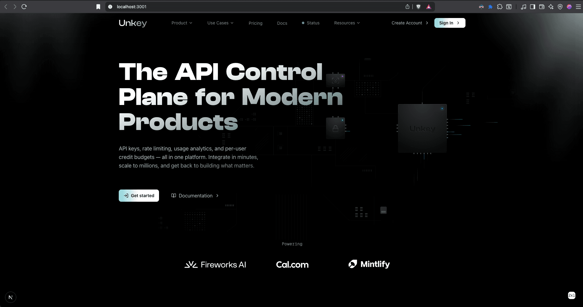
Hero heading
General Sans for body text
Replacing Geist entirely with General Sans didn't improve things enough. The body text needs to be neutral and readable. Geist already does that well.
tracking-tighter on Clash Display
Squished the letterforms together. Clash Display's angular characters need breathing room. Tighter tracking made words blur together and reduced readability.
Clash Display for headlines (angular, geometric, echoes the circuit-board aesthetic), Geist Sans for body. Added wordSpacing on the hero h1 to separate narrow letterforms.
The type system now has two clear layers: Clash Display for display and heading text (geometric, angular characters that echo the circuit board aesthetic), and Geist Sans for body copy (neutral, highly readable). The hero h1 gets additional wordSpacing to prevent Clash Display's narrower characters from crowding together at large sizes.