Hero Layout — Split Composition
Redesigned the homepage hero from a centered layout to a split composition, giving both the text and the circuit board SVG room to breathe.
The centered hero places the mainboard SVG behind the heading text at 2x scale. Both elements compete for the same space.
- -Text unreadable over SVG: Circuit elements overlapped the heading directly. The text had no clean background to sit on, reducing readability and making the hero feel cluttered rather than premium.
- -Animations invisible: The mainboard SVG has subtle animations — pulsing nodes, flowing paths. All of them were hidden behind the heading and subtext. The most visually interesting part of the page was invisible.
- -Neither element wins: When two things occupy the same space, both lose. The text doesn't read cleanly and the illustration can't be appreciated. The hero felt like a compromise, not a design decision.
Hero section
Radial mask on centered layout
Fading the edges of the SVG with a radial gradient mask made the mainboard even less visible — you couldn't tell what the illustration was supposed to be.
iframe/object embed for the SVG
The embedded SVG had its own white background styles that caused a bright blowout against the dark page. Overriding those styles from outside the iframe wasn't possible due to cross-origin restrictions.
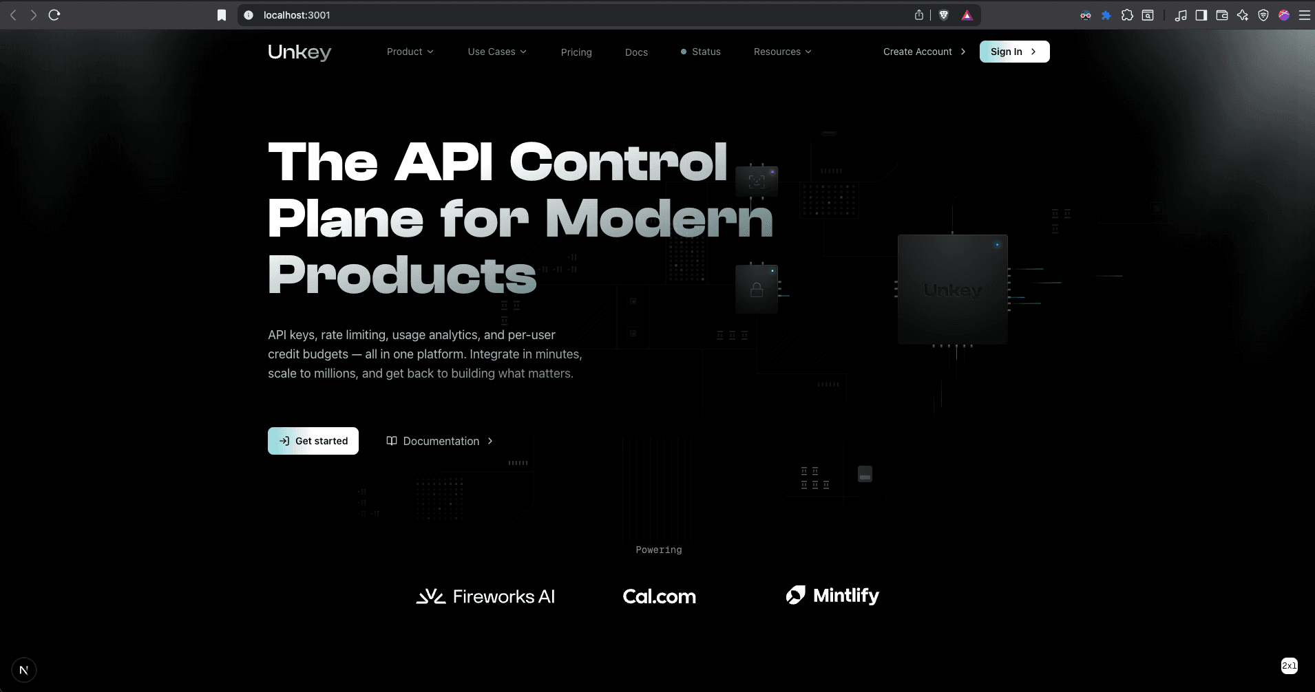
Split layout: text left, circuit board right. Text gets a clean reading zone, the mainboard SVG is fully visible, and animations can be appreciated.
The hero is now a two-column layout on desktop. The left column has the heading, subtitle, and CTA buttons with generous whitespace. The right column displays the circuit board SVG at full fidelity with its animations visible. On mobile, it stacks vertically. This gives each element its own space instead of competing for the same area.